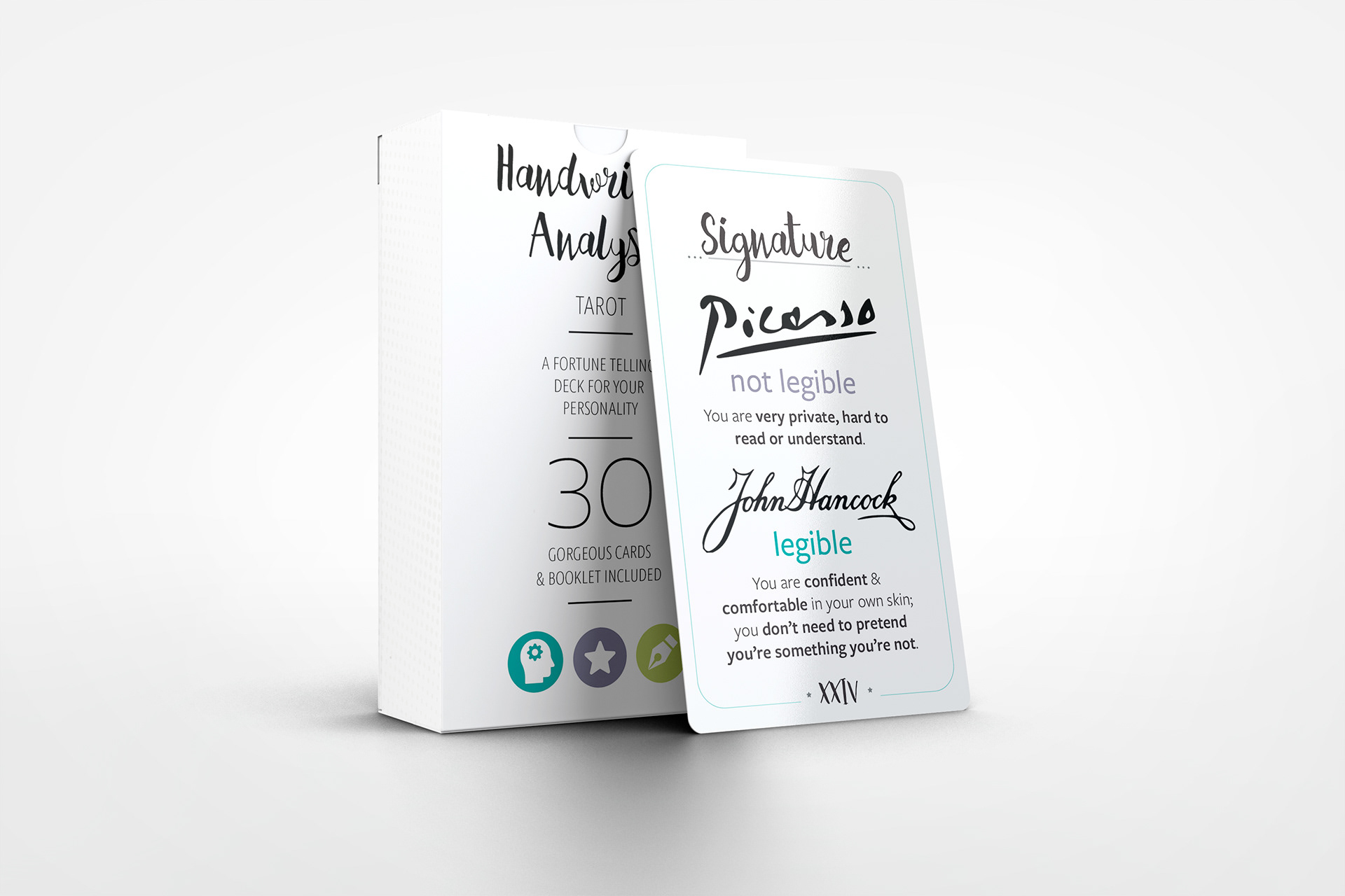
Tarot cards are viewed by many to be fake and hold no value in the way your life is determined. The same can be said for handwriting analysis. Can you really tell if someone is kind or mean just by looking at the size of the loops they make writing words? I felt that the two were a perfect medium to blend together.
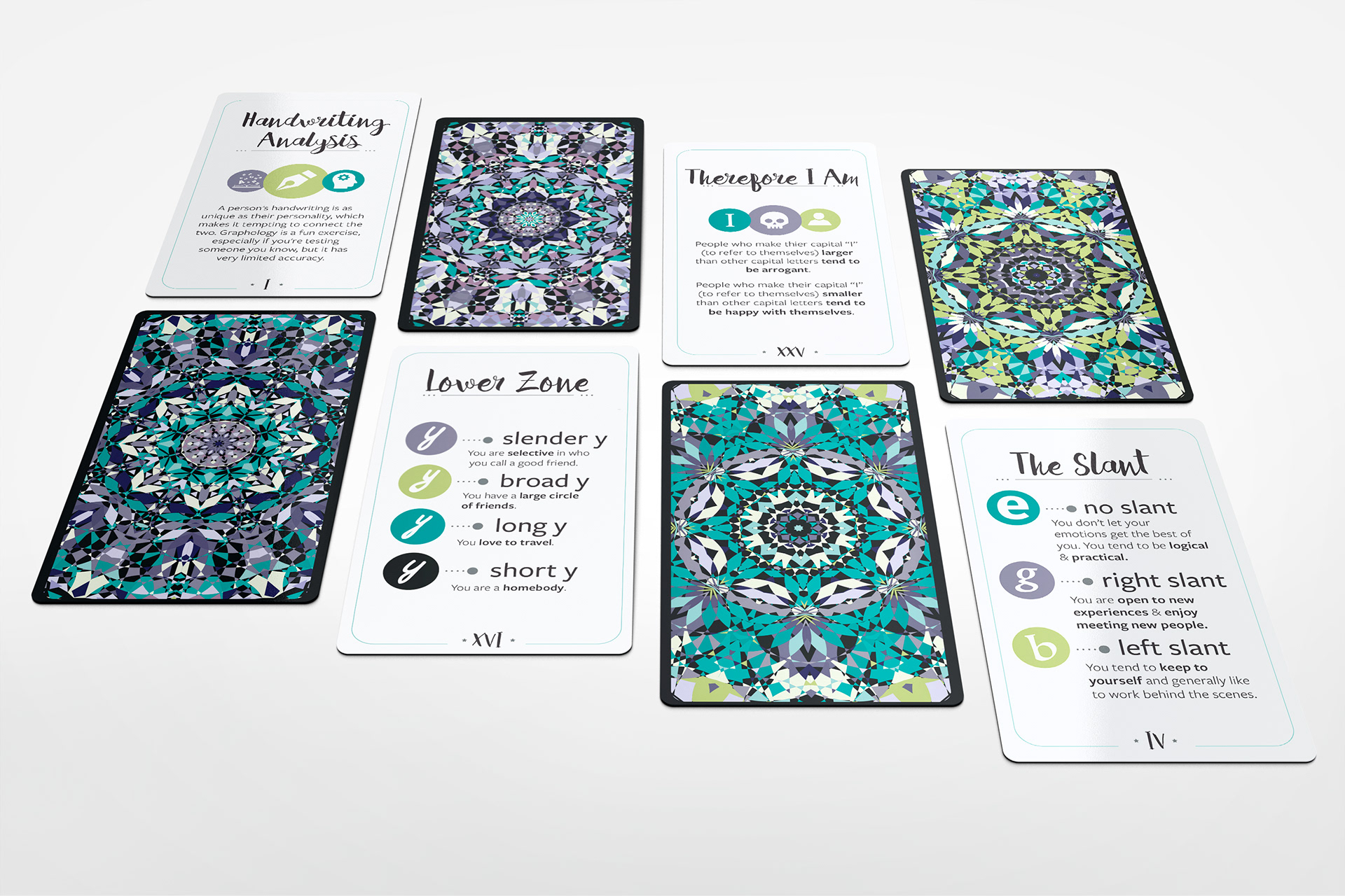
When designing the backs of the cards I wanted to make them geometric and unique. They needed to be colorful too, tarot cards carry colorful designers on them to help the ‘reader’ of the cards as well as give the one getting their fortune told something pleasing to look at.
For the front of the cards they needed to have a lot of information on them but they also needed to look pleasing. I chose small infographics to include with the information as a way to get a quick grasp of what each analysis means. I borrowed colors from the backs of the cards to incorporate into the front so that they felt cohesive.
ILLUSTRATOR | INDESIGN
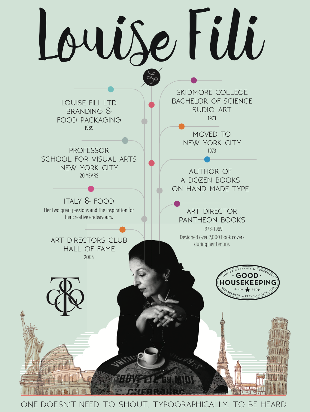
Project inspired by Louise Fili

My poster is the inspiration for the hand writing analysis tarot cards.

